Day 35
Math 216: Statistical Thinking
Describing associations between two quantitative variables
Data: each case \(i\) has two measurements
- \(x_i\) is explanatory variable
- \(y_i\) is response variable
A scatterplot is the plot of \((x_i, y_i)\)
- form? linear or non-linear
- direction? positive, negative, no association
- strength? amount of variation in \(y\) around a “trend”
Example: Associations in Car dataset
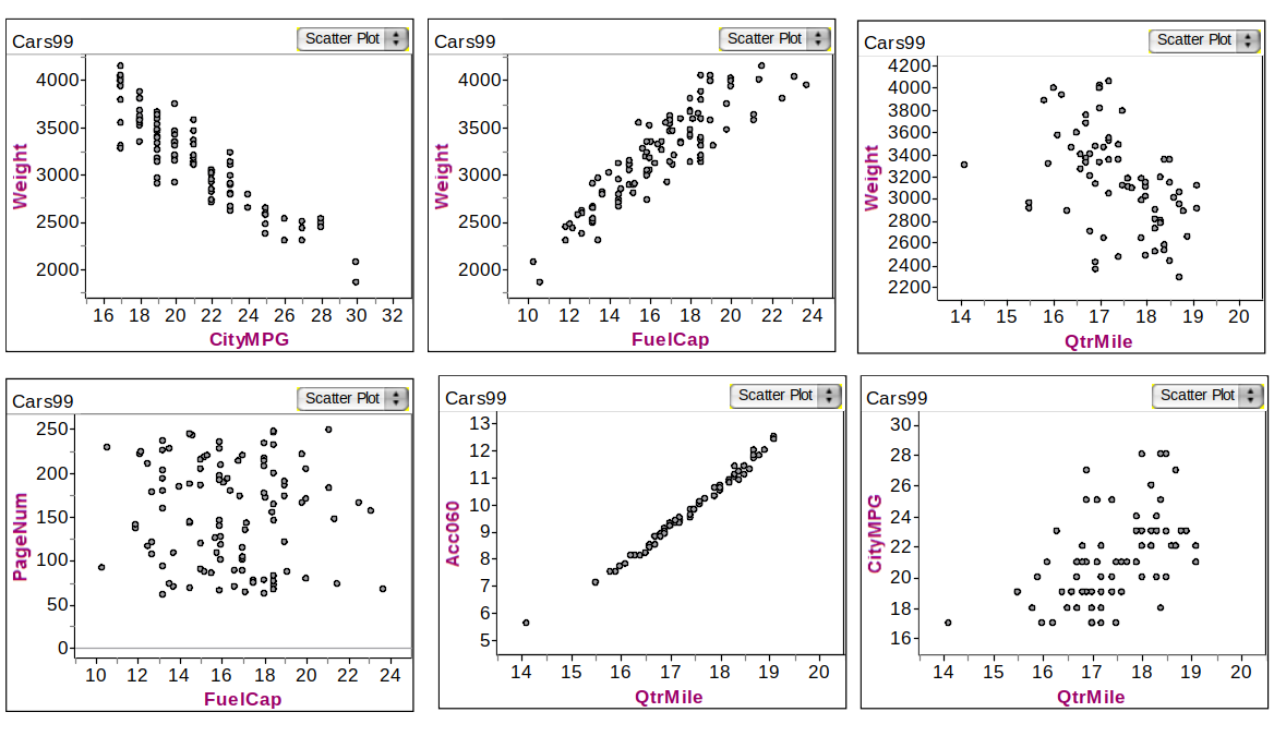
Various Associations of quantitative variables in Cars data
Direction of relationship
positive association: as \(x\) increases, \(y\) increases
- age of the husband and age of the wife
- height and diameter of a tree
negative association: as \(x\) increases, \(y\) decreases
- number of cigarettes smoked per day and lung capacity
- depth of tire tread and number of miles driven on the tires
Understanding Correlation Coefficients \(r\) and \(\rho\)
Correlation coefficients, denoted \(r\) (sample) or \(\rho\) (population), measure the linear relationship between two variables.
Strength varies as \(r \approx \pm 1\) (strong), \(r \approx 0\) (weak).
Direction: Positive (\(r > 0\)) or negative (\(r < 0\)) linear association.
Formula: \[ r = \frac{\sum_{i=1}^n \left(\frac{x_i - \bar{x}}{s_x}\right) \left(\frac{y_i - \bar{y}}{s_y}\right)}{n-1} \]
- Interpretation: \(r = 1\) (perfect positive), \(r = -1\) (perfect negative), \(r = 0\) (no relationship).
Visualization: Scatterplots reveal the clustering around the regression line; outliers can heavily influence \(r\).
Car Correlations
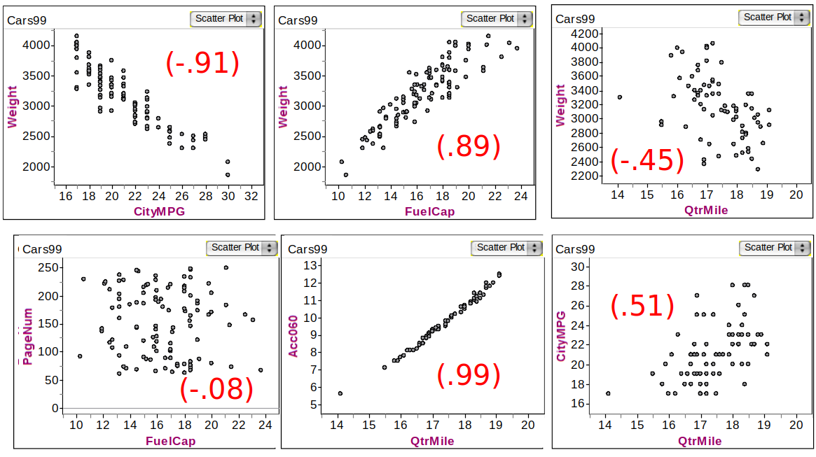
Correlations of various variables in Cars data
Deterministic vs. Probabilistic Models
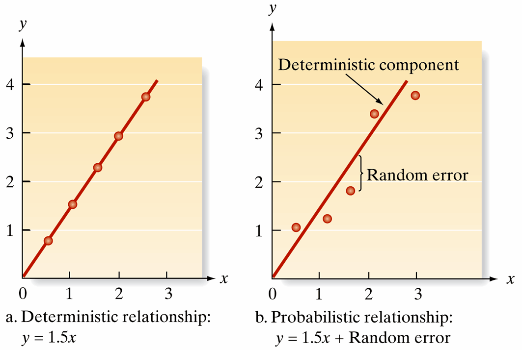
Deterministic vs. Probabilistic Models
- Deterministic Model: Assumes a perfect, predictable relationship without error, e.g., \(y = 1.5x\).
- Probabilistic Model: Incorporates randomness, modeling \(y\) as: \[ y = 1.5x + \text{random error} \]
- General Form: \[ y = \text{Deterministic component} + \text{Random error} \]
- Assumes mean of random error is 0, aligning \(E(y)\) with the deterministic component.
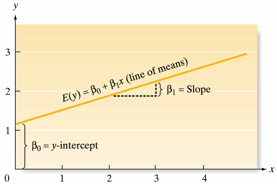
Linear Regression Model
Goal: To find a straight line that best fits the data in a scatterplot.
- Regression Equation: \(\hat{y} = b_0 + b_1x\)
- \(x\): explanatory variable \(\qquad\) \(\hat{y}\): predicted response variable
- Parameters:
- Slope (\(b_1\)): Increase in predicted \(y\) for every unit increase in \(x\). \[ b_1 = \frac{\text{change }\hat{y}}{\text{change } x} \]
- Intercept (\(b_0\)): Predicted \(y\) value when \(x = 0\). \[ \hat{y} = b_0 + b_1(0) = b_0 \]
SLR: Fitting and Evaluation
- Steps:
- Hypothesize the deterministic component (e.g., \(E(y) = \beta_0 + \beta_1x\)).
- Estimate model parameters using least squares.
- Assess the fit and use the model for prediction.
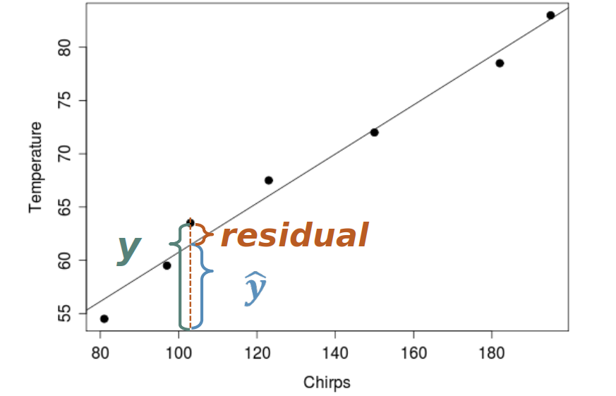
- Residuals:
- Geometrically, a residual is the vertical distance from each point to the regression line, helping measure model fit.
Residuals
Implementing SLR
- Example: Understanding the relationship between temperature and cricket chirp rate.
- Model cricket chirp rate as a function of temperature.
- Methodology:
- Utilize observed data to fit a linear model that predicts cricket chirp rate based on temperature.
- Calculate deviations to assess model fit and refine parameters as needed.
Data Overview
| Observation | Temperature (°F) | Chirp Rate (chirps/15 sec) |
|---|---|---|
| 1 | 89 | 20 |
| 2 | 72 | 16 |
| 3 | 93 | 20 |
| 4 | 84 | 18 |
| 5 | 81 | 17 |
| 6 | 75 | 16 |
| 7 | 70 | 15 |
| 8 | 82 | 17 |
| 9 | 69 | 15 |
| 10 | 83 | 16 |
| 11 | 80 | 15 |
| 12 | 83 | 17 |
| 13 | 81 | 16 |
| 14 | 84 | 17 |
| 15 | 76 | 14 |